Intro to Flutter Widgets Series (Part 1)
Everything in Flutter is a widget. A widget defines how a portion of a screen should look like. Let's take a look at the common UI widgets and how they're used to define how a certain portion of a screen looks like.
Everything in Flutter is a widget. A widget defines how a portion of a screen should look like. Let's take a look at the common UI widgets and how they're used to define how a certain portion of a screen looks like.
Text
A Text widget allows you to display text in your app.
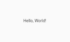
Text('Hello, World!')
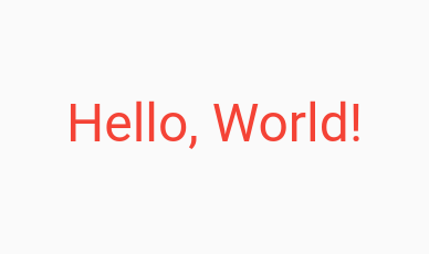
You can define how the text looks like by using a TextStyle.
Text(
  'Hello, World!',
  style: TextStyle(
    color: Colors.red,
    fontSize: 48,
    fontWeight: FontWeight.w500, // Medium weight
  ),
)
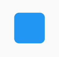
Container
A Container widget lets you create a rectangular element. It can be decorated to with a BoxDecoration, allowing you to change the color, border radius, etc.
Container(
  height: 100,
  width: 100,
  decoration: BoxDecoration(
    borderRadius: BorderRadius.circular(16),
    color: Colors.blue,
  ),
)
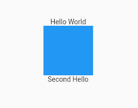
Column
A Column widget allows you to display a list of widgets in a vertical fashion.
Column(
  children: [
    Text('Hello World'),
    Container(
      height: 100,
      width: 100,
      color: Colors.blue,
    ),
    Text('Second Hello'),
  ],
)
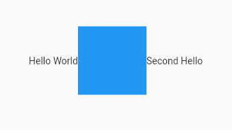
Row
A Row widgets allows you to display a list of widgets in a horizontal fashion.
Row(
  children: [
    Text('Hello World'),
    Container(
      height: 100,
      width: 100,
      color: Colors.blue,
    ),
    Text('Second Hello'),
  ],
)
/
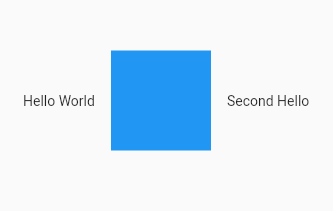
SizedBox
You may have noticed that the widgets inside Column and Row are cramped up. SizedBox is one way of adding spacing between the widgets.
Row(
  children: [
    Text('Hello World'),
    SizedBox(width: 16),
    Container(
      height: 100,
      width: 100,
      color: Colors.blue,
    ),
    SizedBox(width: 16),
    Text('Second Hello'),
  ],
),
Padding
Padding is a way of adding spacing around a widget. Its difference between SizedBox will be discussed below.
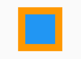
Container(
  color: Colors.orange,
  child: Padding(
    padding: const EdgeInsets.all(24),
    child: Container(
      width: 100,
      height: 100,
      color: Colors.blue,
    ),
  ),
),
Padding vs SizedBox
A SizedBox is an invisible box that consumes space based on the width and height values passed to it.
A Padding allows you to add spacing around its child widget. We used Padding in the Padding example because it doesn't force you to constrain the dimensions (the width and height) of its child. It adds the spacing around the child.
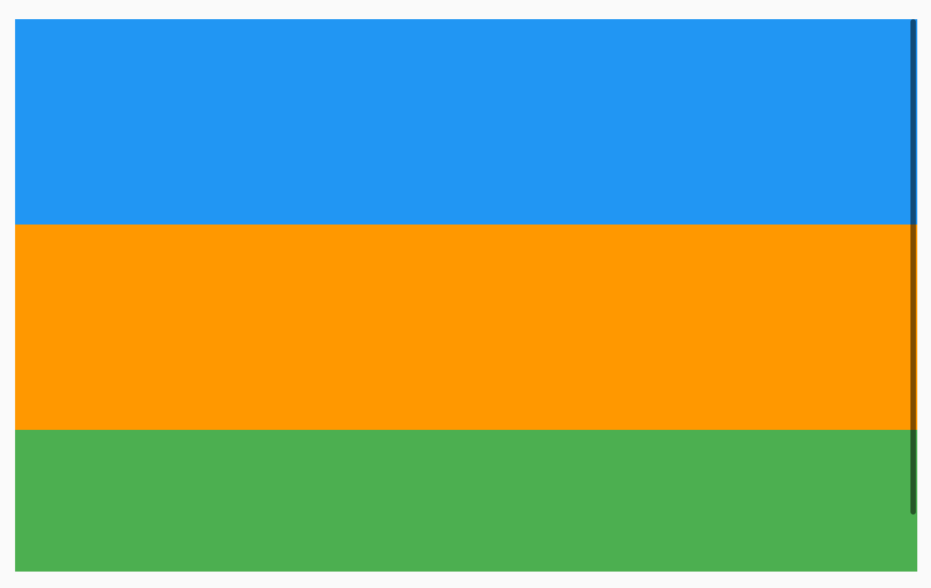
ListView
A ListView is very similar to a Column or Row, except it allows you to scroll through its children in the specified direction. By default, the ScrollDirection is set to vertical.
ListView(
  children: [
    Container(
      height: 300,
      width: double.infinity,
      color: Colors.blue,
    ),
    Container(
      height: 300,
      width: double.infinity,
      color: Colors.orange,
    ),
    Container(
      height: 300,
      width: double.infinity,
      color: Colors.green,
    ),
  ],
)
I also recommend trying this interactive example
Icon
An icon just displays an icon. Here's an example:
Icon(Icons.home)
Icons.home is a reference to one of the many icons provided to you by Material Icons.
Similar to Text, an Icon can be styled to your liking:
Icon(
  Icons.home,
  size: 36,
  color: Colors.blue,
)
Button
Buttons in Flutter are pre-configured to look like the buttons defined in the Material Design Specs. Here are the list of different pre-configured buttons in Flutter. The easiest to use is a TextButton, so lets take a look at how to use it.
TextButton(
  onPressed: () {
    print('Button is pressed');
  },
  child: const Text('Press Me'),
),
This ends Part 1 of this series. I hope you learned a lot by reading this article 🙂
Sources
- Listview class Null Safety. ListView class - widgets library - Dart API. (n.d.). Retrieved from https://api.flutter.dev/flutter/widgets/ListView-class.html
- New buttons and Button themes. Flutter. (n.d.). Retrieved from https://docs.flutter.dev/release/breaking-changes/buttons
- Buttons - Material Design. Material design. (n.d.). Retrieved from https://material.io/components/buttons